Re-designing the user interface of Whatsapp by using Skeumorphism UI Style.
Year:
2024
Category:
UI Design
Client:
Self-Driven Project

Strategy
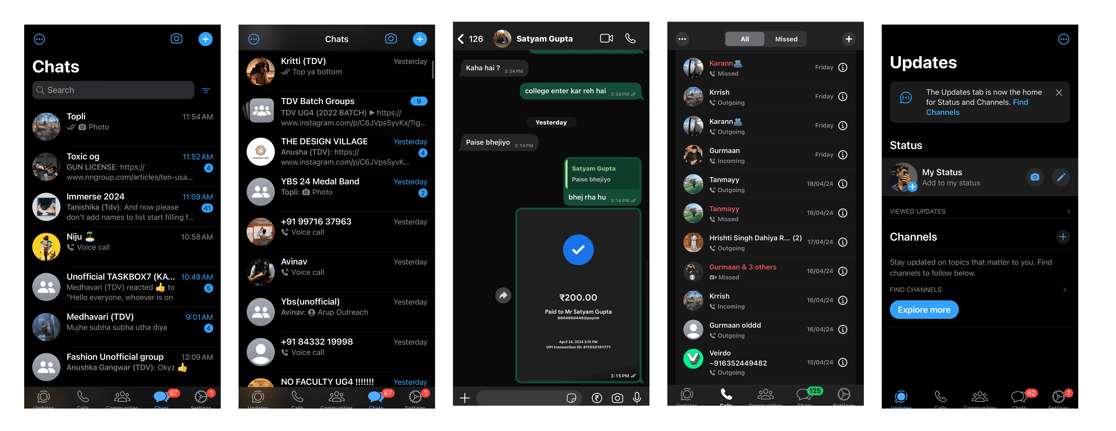
WhatsApp is one of the most widely used communication apps, known for its simple and functional interface. However, the current design follows a flat UI style that prioritises minimalism but sometimes lacks visual depth and tactile engagement. This project explored how skeuomorphic design could be reintroduced in a subtle and modern way to make the interface feel more interactive and visually rich while maintaining the familiar usability that users are comfortable with. The goal was to enhance the emotional and visual experience without disrupting WhatsApp’s intuitive navigation.
Design
The redesign applied skeuomorphic principles by introducing depth, soft shadows, highlights, and layered elements across the interface. Chat bubbles were redesigned to appear slightly raised, giving messages a tactile presence during conversations. Navigation buttons and interface components were refined with subtle 3D styling to make interactions feel more responsive and tangible. The chat list and updates sections were also reworked to create a clearer visual hierarchy while maintaining WhatsApp’s clean layout. The design balances realism with simplicity, ensuring that the interface remains easy to use while feeling more immersive and engaging.
Results
The redesigned interface presents WhatsApp in a visually enhanced form while preserving its familiar structure. The use of skeuomorphism adds warmth and dimension to the experience, making everyday interactions feel more natural and comfortable. The final outcome demonstrates how a classic design style can be adapted in a modern way to enrich user engagement without compromising clarity or usability.
Heuristic Evaluation
Challenges identified
Identified visual clutter and dense chat lists, making it harder to scan conversations quickly.
Noticed inconsistent hierarchy between chats, calls, and media features, affecting clarity of navigation.
Observed limited feedback for actions like sending messages, payments, or file sharing.
Found feature overload within the chat interface, which may overwhelm users during simple tasks.
Some icons and controls lack clear affordance, making interactions less intuitive.
Certain screens show information-heavy layouts, reducing readability and focus on primary actions.
Micro Animations
Final Result


Projects
other

